
UP & DOWN — Branding
UP & DOWN is an interactive play place for children. We designed its logo and a playful identity in joyful colours, and applied them to the business card, the envelope and the letterhead.
- Sector
- Children's play and entertainment
- Year
- 2023
- Services delivered
- Visual Identity & Logo Design
Visual Identity & Logo Design
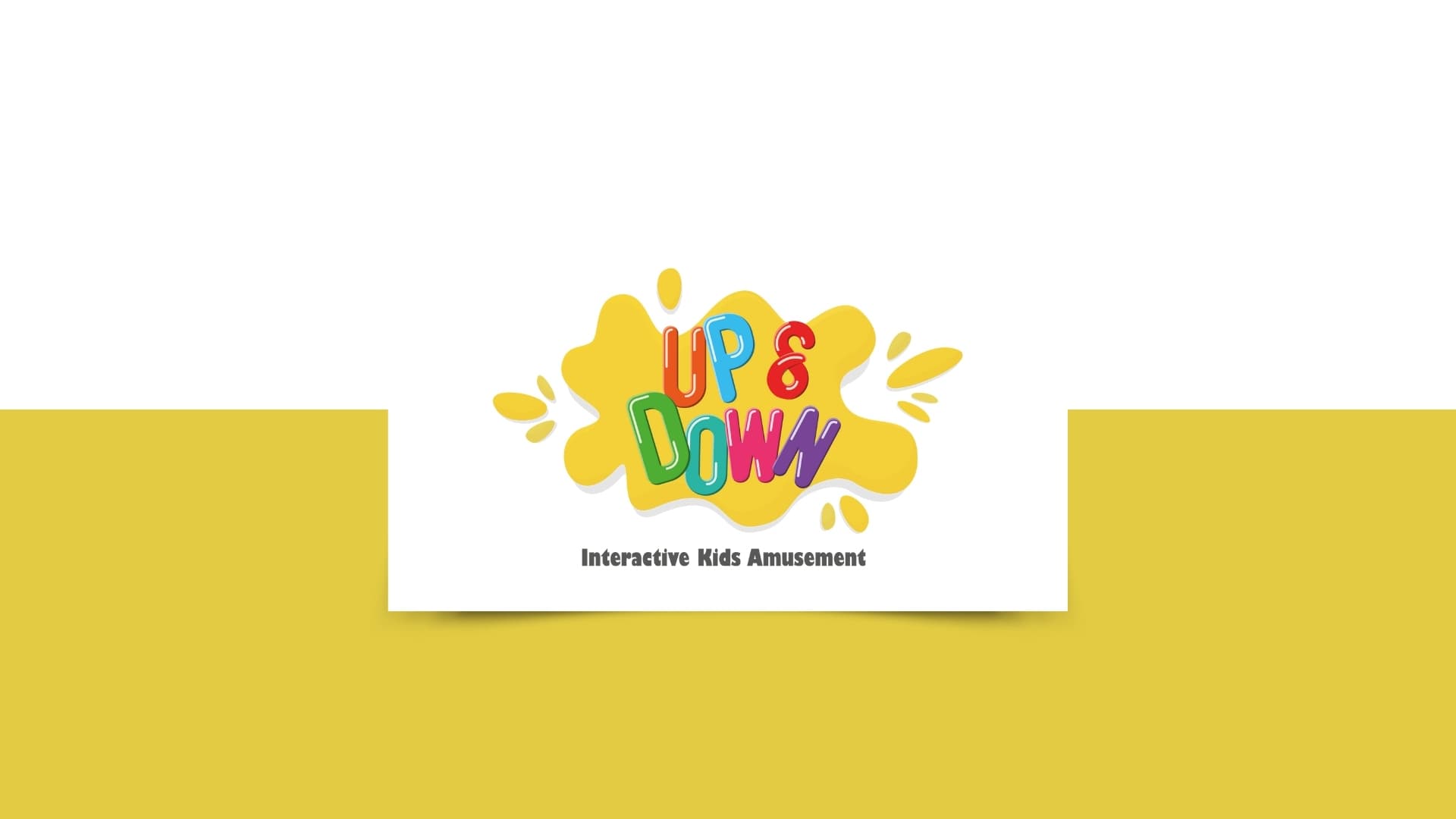
Every letter in the logo has a different colour and a different tilt, as if the letters were jumping, which is what the name itself says: up and down. The yellow splash behind the name becomes, on the card, envelope and letterhead, an orange or red wave on the edge of the page, so the printed pieces stay playful without getting crowded. We defined the six colours by their codes so they print and display in the same shade every time.
About this serviceWhat we delivered
- Logo in multicoloured letters over a yellow splash, with the line “Interactive Kids Amusement”
- A palette of six colours defined by their codes
- Two-sided business card with a QR code
- Envelope
- Letterhead in two designs
- The “splash” shape as a decorative element repeated across the printed pieces
Want a result like this?
Tell us about your project and our team will get back to you.
Book a consultation