
Sama Taibah — Branding
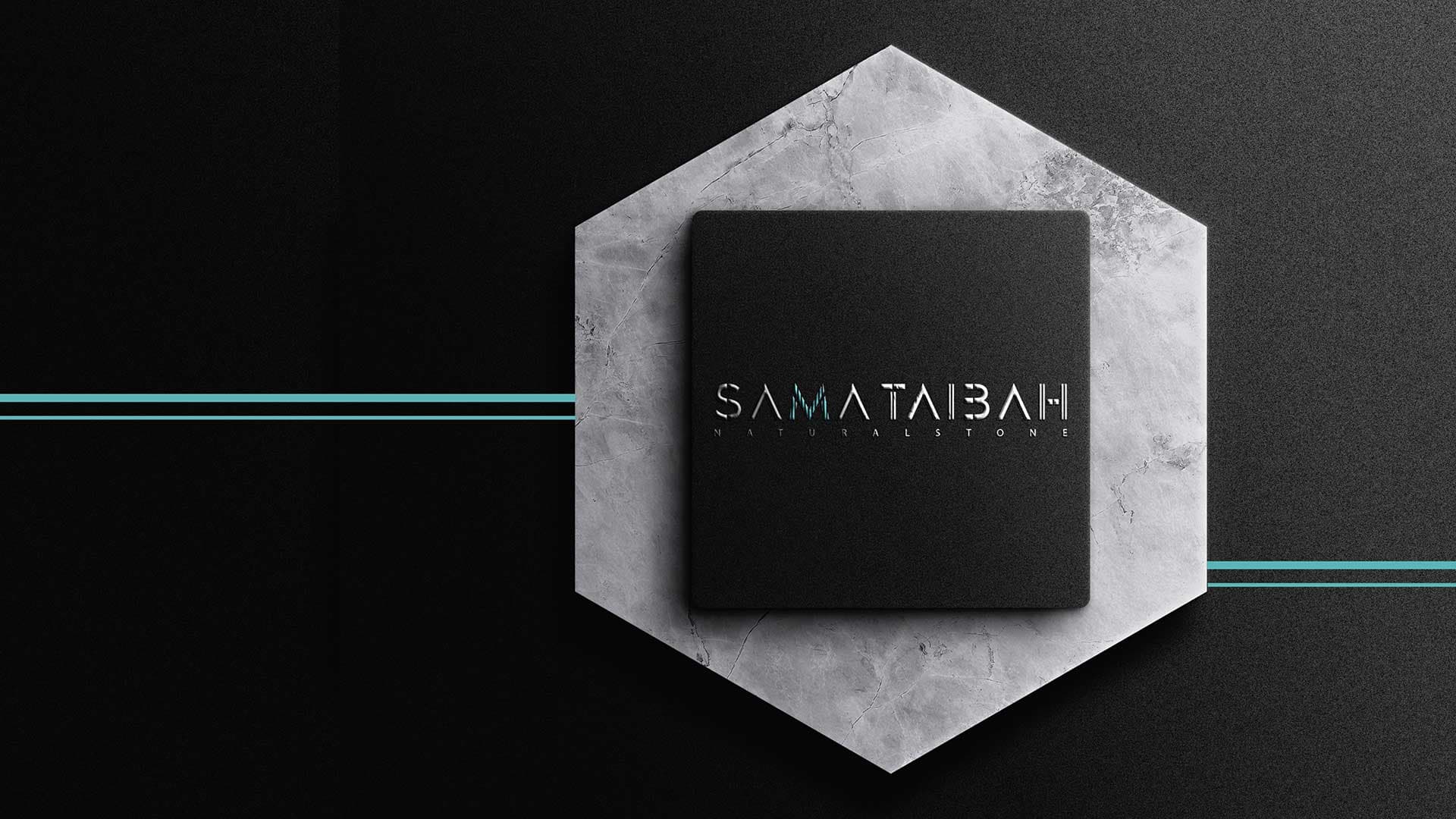
Sama Taibah works in natural stone and architectural cladding. We designed a wordmark and a simple visual identity in black, grey and turquoise, and applied them to the company's stationery and to mock-ups that show the logo on stone and façades.
- Sector
- Natural stone and architectural cladding
- Year
- 2023
- Services delivered
- Visual Identity & Logo Design
Visual Identity & Logo Design
The letters are cut with straight lines as if carved from slabs, which ties the name to the company's work in stone and cladding. One letter only is hatched in turquoise lines, so it becomes a small mark the company is recognised by. Black and grey recall the colours of stone, and turquoise is a single colour used sparingly on the card and letterhead. We showed the logo on marble, concrete and a building façade so it is seen in places close to its field of work.
About this serviceWhat we delivered
- An English wordmark in geometrically cut letters, with the line “Natural Stone”
- Three colour versions of the logo: on black, on white and on turquoise
- The logo's construction drawing on a geometric grid
- Two-sided business card, turquoise and black, with a QR code
- Letterhead and envelope in the same identity
- Mock-ups of the logo applied on marble and concrete
- A mock-up of an illuminated sign on a façade
Want a result like this?
Tell us about your project and our team will get back to you.
Book a consultation